Many artists working in the area of printmaking realise that the technique they have chosen to use is extremely important. In many ways, the graphic technique used to create a print defines that print's quality and value to a great extent. Because printmaking is an art-form which relies exclusively on the "matrix" (plate, stone etc.) as an intermediate medium to produce the final work, it is very restricted in its expressive means. The considerable physical effort involved and the harmful effect of the traditional materials used in printmaking (inks and acids) and moreover, the fact that one must produce a multiplicity of copies, make it one of the most difficult areas for artistic expression. The ability to make multiple copies is often confused by people who do not know the specifics of printmaking with the similar capability for multiplicity of digital printing, as well as with the so called "limited editions", which are gaining popularity. There is a significant difference, however, between the manually created print and the one achieved by computer manipulation or other mechanical means. The sheet created manually has all the necessary merits to be called an "original", since it has passed from start to finish through the human essence of the artist and his or her hands.
Despite the fact that technique is often just viewed as a means of expression and nothing more, in printmaking, more than in any other art-form, graphic technique can become a sort of "formula" or "signature" of a personal style. Such is the case with me and my monoprints. Whoever uses this technique will also resemble my style, however, the expression within this is limitless.
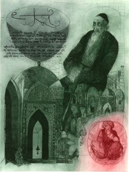
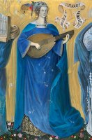
About the Wine and Omar Khayam I, etching, aquatint, 32x24 cm, 1983
Achieving a new technical and artistic approach for producing bright, beautiful colours in my monoprints took me a lot of time and effort. After a series of experiments, I managed to make my first prints with such bright and vivid colours in the intaglio process ("Memories of the Old Netherlands") in 1985.
To give my reader some background, intaglio is a family of printmaking techniques where the image is incised into an intermediate medium – matrix or plate. The intaglio techniques include drypoint, etching, aquatint, engraving and mezzotint. Once the image is created on the plate, ink is applied to the surface of the plate. Excess ink is cleaned away so that it remains only in the incisions. A damp sheet of paper is placed on top of the inked plate and they are run through a hand-pulled printing press that, through pressure, transfers the ink onto the paper.
Colours in the standard intaglio process are usually achieved through manually colouring the paper of the printed work, through printing the work directly with colour inks, or by printing several times on the same sheet of paper using more than one plate. Here is an example of an etching (right), which is done in a traditional way using colour inks. The difficulty is when one wants to create bright, vivid colours. In my approach, such colours are achieved without using the traditional methods for coloration mentioned above; to those who know the standard intaglio process in detail, the colours on my final monoprints seem procured by magic!
Like any new development, however, my technique also builds on traditional printmaking approaches. I combine etching, aquatint and an approach similar to the monotype in a unique way to create the final imprint, which carries new qualities, depths and, most importantly, a bright, painting-like colourful organic wholeness and harmony. Technically I use only one (zinc) plate upon which the composition is developed; the printing itself is realised in several consecutive stages until the final result is achieved. Because of its similarity to the monotype (coming from the fact that the colours cannot be applied absolutely identically for every print), every single print is unique and varies in its coloration. The same image can be printed with different colours, as shown below, which provides a great opportunity for the artist to enjoy and experiment using various colorations.
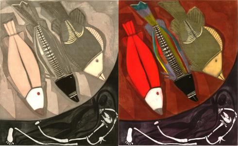
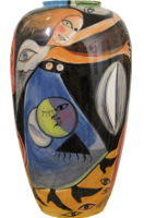
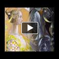
Body and Soul (from The Dreams of the Fishes), 1996, 50x60 cm, unique colour intaglio
Because of the novelty of my approach (even though it builds on old and traditional graphic techniques), I was unsure how to name it for many years; in the past I have undersigned my monoprints with "mixed technique", "a la poupee", "colour intaglio" and others. My final decision is to call it "unique colour intaglio".
The capabilities of this graphic technique are extremely wide. In the process of my work through the years I succeeded in perfecting it to a highly professional level. My monoprints have been successfully exhibited and sold in personal and group shows around the world and have also been used for book covers, book illustrations, wine labels etc. Many of my prints are part of private, corporate and public collections.
Perhaps it is in order for me to mention that, to date, there is only one other artist to whom, during my years in Bulgaria, I taught the secrets of this original technique, and who continues using it to this day to express her personal ideas and compositions. However, her work is of an entirely different nature, and should by no means be confused with mine, even if the style exhibits external similarity purely because of the technique used – a technique which is an expression of my own, personal style.
 The Musical Connection in My Paintings
 On Fractality – cast in the form of a children’s story


 Poetry in English – a short collection
 Poetry in Bulgarian – a short collection